Hi, I'm Luke Beretta. Product designer and developer based in Cape Town.
I've created products across fintech, crypto, SaaS, retail, and consumer experiences.
My work has supported the movement of trillions of dollars, enabled payments across emerging markets,
helped venture‑backed startups win awards, and served millions of retail customers.
Journey
Journey helped teams communicate complex ideas at the moments that shaped outcomes. Proposals,
onboarding, introductions where clarity determines what happens next. I partnered with the founding designer on
Journey 2.0, each owning distinct parts of the product end to end as we rethought it as a flexible
block‑based system with integrated AI and a redesigned analytics layer. The architecture became the
foundation the acquiring company inherited.
Role: Senior Product Designer
Timeline: Sep 2022 – Dec 2023
Teams: Founders, Product, Engineering, AI/ML
Understanding the Space
I audited Notion, Pitch, and Coda to understand how leading tools approached flexible content
creation. The pattern was consistent. Each had built powerful authoring systems while largely ignoring the
reading experience. Structure, pacing, and clarity for the recipient were secondary.
The organising principle was designing for creator and reader as a single system.
Competitive analysis. Mapping creator and
reader experience across Notion, Pitch, and Coda.
The gap. Existing tools built powerful
authoring systems while the reading experience went largely undesigned.
Design Direction
The move was away from rigid slide structures toward a fluid block canvas where structure
emerged from the content rather than constraining it. Creators could move non‑linearly, combining text,
media, and interactive elements the way ideas actually get communicated.
Onboarding had to account for very different starting points. Some users needed a template,
others wanted AI to generate a first draft, others just needed a blank canvas. I designed multiple entry points
so creators could start the way they worked, not the way the product assumed they would.
Visual coherence was a harder problem. I designed a theming system that derived brand identity
from a company domain, generating coherent styles without requiring any design knowledge. Every Journey felt
considered regardless of who built it.
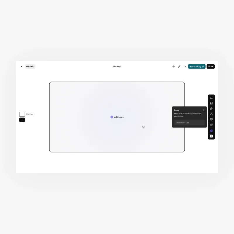
Block canvas editor. Modular, non‑linear
storytelling with flexible content types.
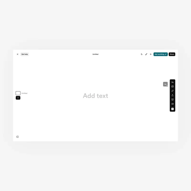
Blank canvas. One of three entry points,
alongside templates and AI‑generated drafts.
Automated theming. Brand coherence derived from
a company domain, no design knowledge required.
Validation
I ran structured tests across canvas and onboarding variations, from constrained layouts to
fully open systems. The block‑based canvas with guided entry points consistently performed best. Users
reached their first publish faster, abandoned less at the blank state, and reported more confidence in what they
were producing.
Testing variants. Canvas and onboarding
approaches evaluated side by side.
Outcomes. Time to first publish and blank state
abandonment across tested configurations.
Solution
The block system replaced fixed slides with a format that adapted to the content. Text, video,
embeds, and interactive elements could be combined freely, the layout adjusting across screen sizes without
manual intervention. It felt less like a presentation and more like a living document.
I designed the reading experience with the same rigour. I structured content for clarity,
pacing, and engagement. Recipients could move through ideas on any device.
Journey 2.0. A responsive, context‑aware
storytelling format.
Recipient experience. Designed for clarity,
pacing, and engagement across devices.
Interactive blocks. Text, video, and embeds
combined in a single narrative surface.
AI Across the Full Loop
I integrated AI across the full product loop rather than treating it as a standalone feature.
On the creation side, users could describe what they wanted to communicate and receive a structured draft to
refine in context. Inline tools supported block‑level editing without breaking flow.
On the consumption side, an Ask Anything panel let recipients query the content directly. I
designed each surface to feel native rather than grafted on. AI shaped how the product worked, not just what it
could do.
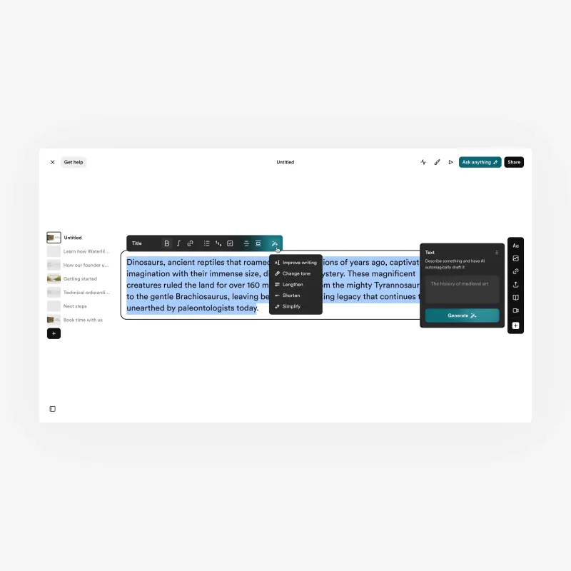
AI‑assisted creation. Describing intent
and receiving a structured draft to refine.
Inline AI editing. Block‑level
refinement without leaving the canvas.
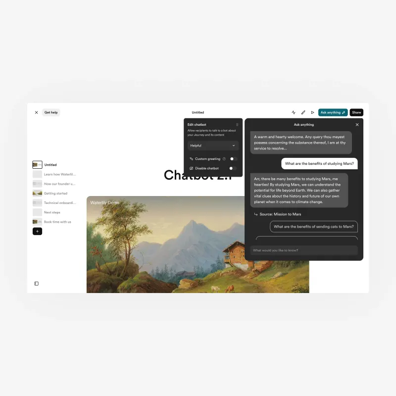
Ask Anything. Readers query the content
directly, turning reading into an active session.
Analytics
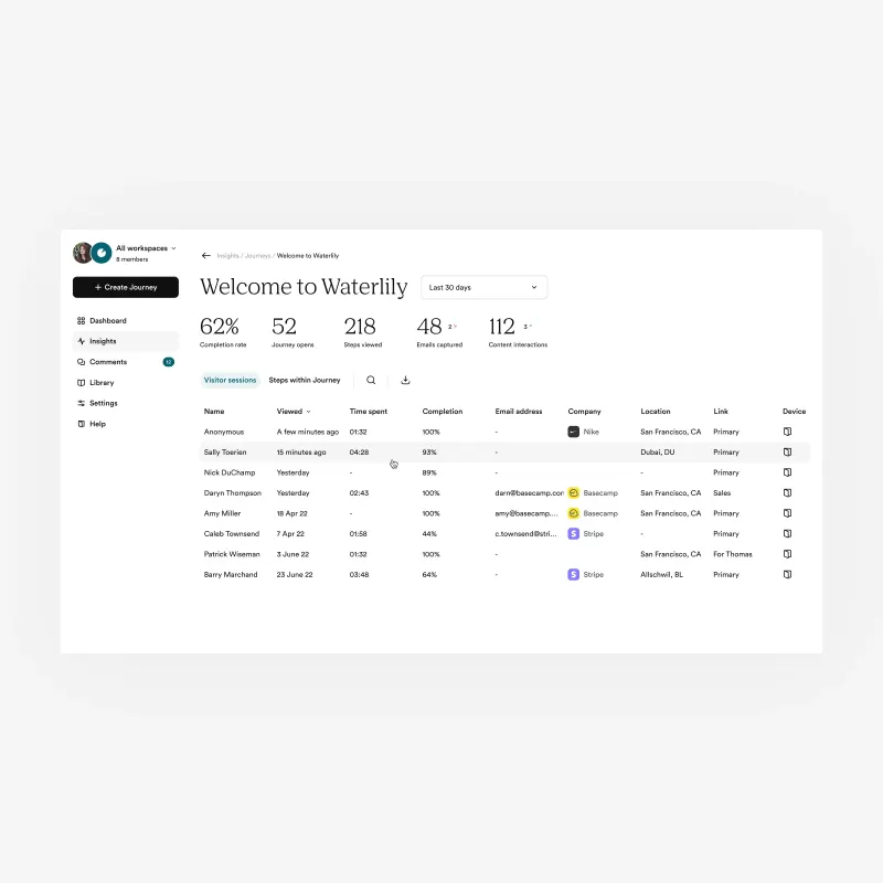
The redesigned analytics layer gave creators clear visibility into how their content landed.
One view showed session behaviour, time spent, and reader progression through each section.
Publishing became a feedback loop. Creators could see how their ideas landed and refine
accordingly.
Session analytics. Reader progression, time
spent, and engagement surfaced per Journey.
Impact
Time to first publish improved as onboarding gave creators clearer ways to begin. Blank state
abandonment dropped. AI features extended the product's value across the full session, deepening both creation
and consumption.
The 2.0 architecture became the foundation the acquiring company inherited. The acquisition was
a direct outcome of what the redesign established.
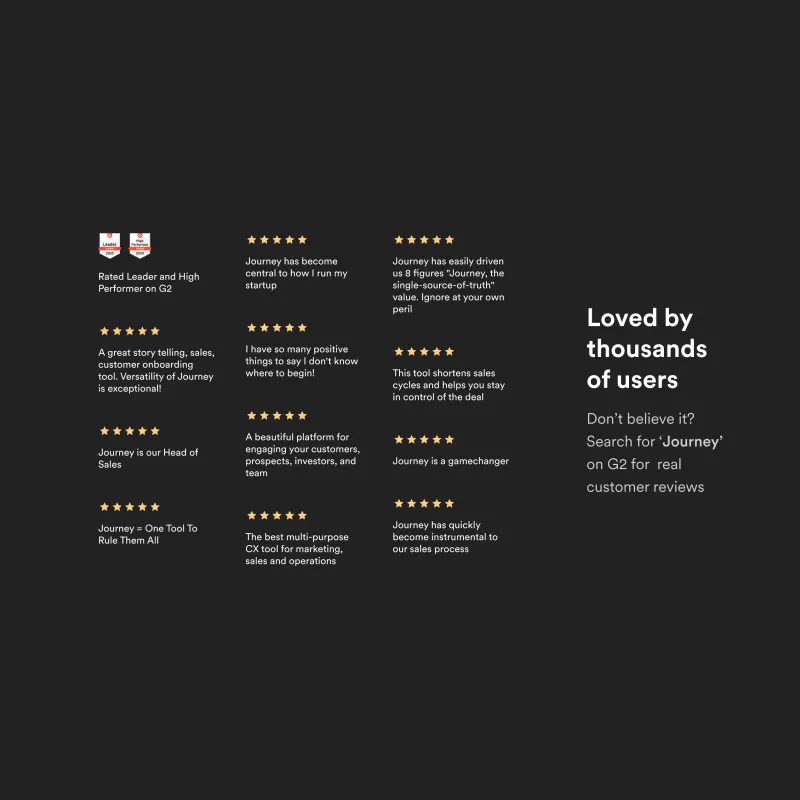
User reviews. G2 ratings reflecting improved
creator confidence and engagement.
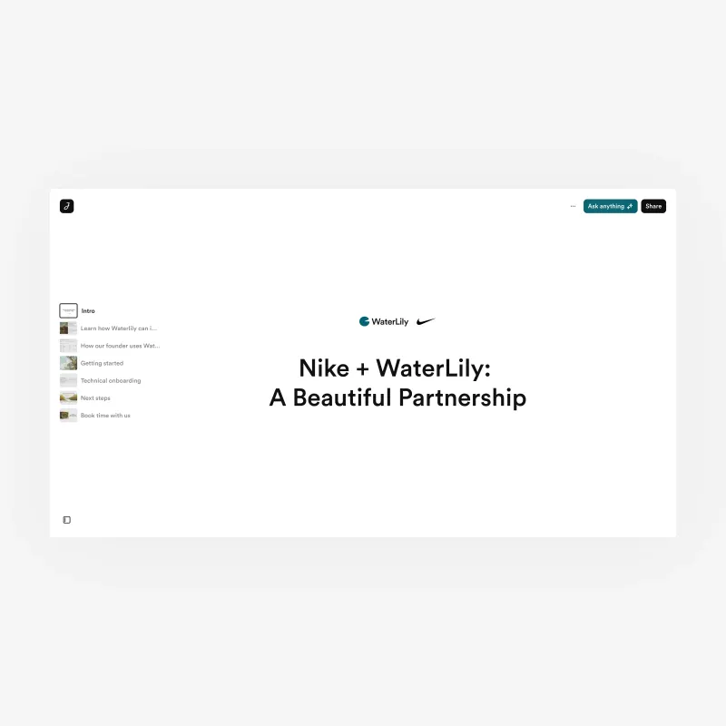
Reader experience, desktop. The published
Journey as received by a recipient.
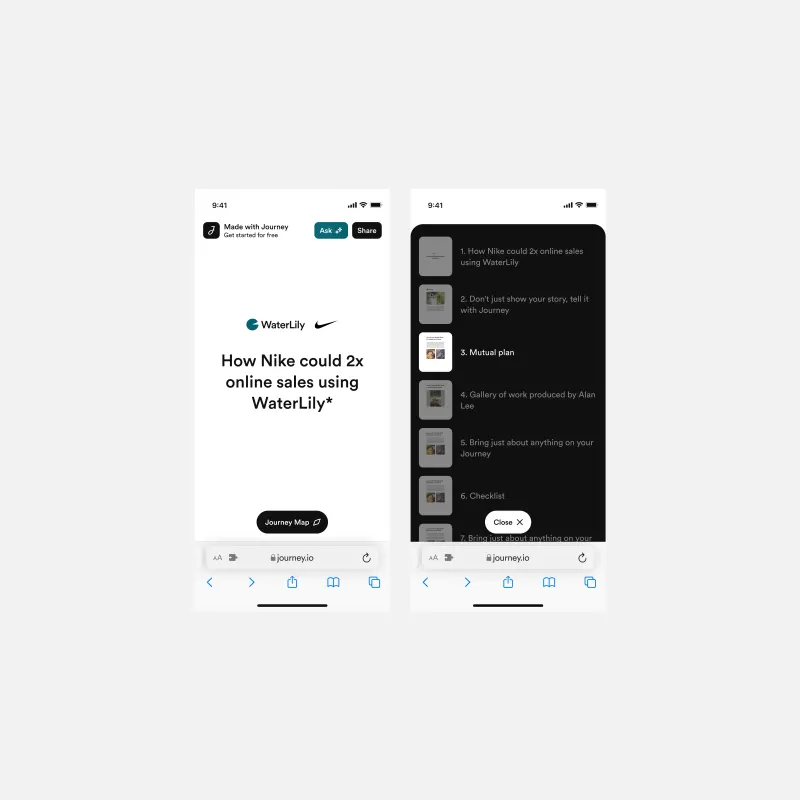
Reader experience, mobile. The same Journey
adapted for mobile without manual adjustment.
Outcome
The most important insight from Journey was that creation and consumption are a single design
problem, not two separate ones. Every decision about the editor had implications for the reader. Getting that
right is what made the product worth acquiring.
Spritz Finance
Spritz bridges the gap between crypto and everyday financial life, allowing users to pay bills,
off‑ramp to their bank, and spend globally via a Visa card, all funded by crypto. I joined as the sole
product designer just as an external agency had finished a new brand identity. The entire product needed to be
rebuilt around it. Over the following year, I led design across the full app suite, establishing the system
foundations and carrying that through into every major feature and flow across the product.
Role: Principal Product Designer
Timeline: Nov 2024 – Nov 2025
Teams: Product, Engineering, Marketing
Brand & Design System
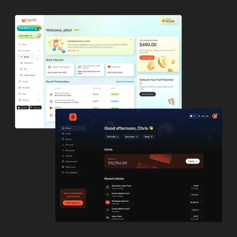
The new brand marked a decisive shift in how Spritz positioned itself. What had previously
felt like a soft, fintech‑adjacent product became darker, more restrained, and aligned with
crypto‑native expectations. I translated that identity into a system that could support a rapidly
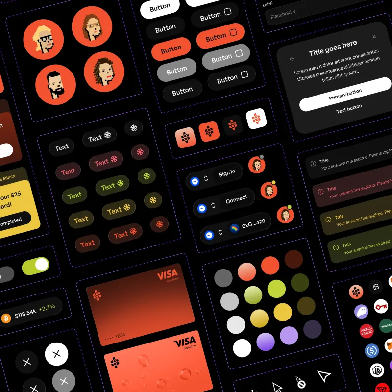
evolving product. I designed Aperol, a comprehensive design system built in Figma that defined colour,
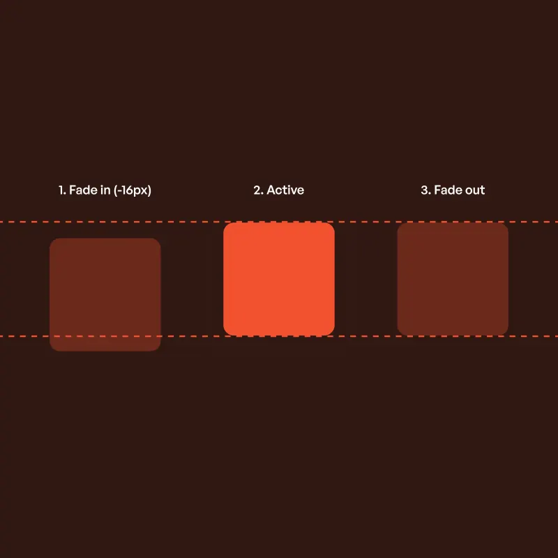
typography, iconography, variables, and a complete component library. I treated motion as a first class
concern, defining interaction behaviour through spring physics so that overlays and transitions felt consistent
across contexts. Design, engineering, and marketing adopted the system as the shared foundation for how the
product was built, extended, and maintained.
Aperol design system. Covering foundations,
variables, and a full component library built for scale.
Motion specification. Using spring physics to
define consistent interaction behaviour across the product.
Dashboard before and after. Showing the shift
from a softer fintech aesthetic to a more restrained, crypto‑native language.
Onboarding & KYC
Spritz served two fundamentally different audiences, crypto‑native users connecting
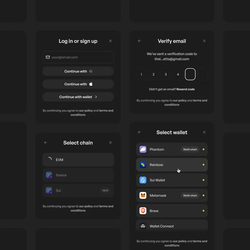
wallets and new users entering through more traditional signup methods. I designed a unified authentication flow
that handled both without compromise, supporting email, Google, Apple, and wallet connections across multiple
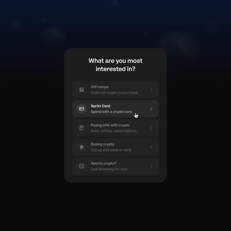
chains within a single coherent entry point. Early in the experience, a welcome screen captured user intent and
routed users based on their goals, feeding directly into backend segmentation and lifecycle systems to create a
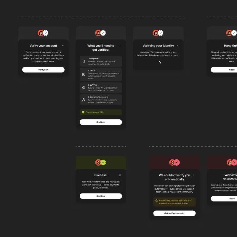
clearer connection between onboarding and long‑term engagement. KYC had previously been fragmented across
the product, appearing in different forms depending on where users encountered it. I consolidated this into a
single, predictable flow that could be invoked consistently wherever verification was required, reducing
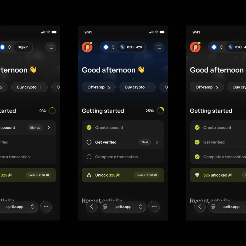
confusion and improving completion. A persistent getting started checklist anchored the early experience,
tracking progress across account creation, verification, and first transaction while reinforcing momentum
through visible rewards.
Unified authentication flow. Supporting both
traditional and wallet‑based entry points.
Intent capture. Routing users based on goals
and feeding segmentation data into lifecycle systems.
KYC pre‑screen. Setting expectations
before entering verification.
Getting started checklist. With progress
tracking, error states, and reward incentives.
Cards
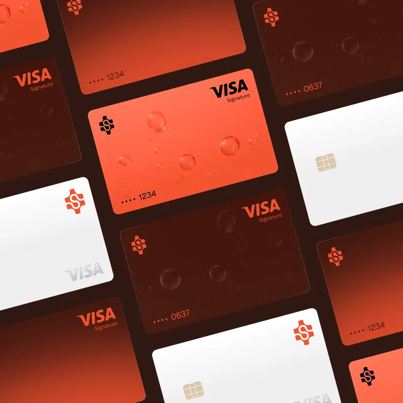
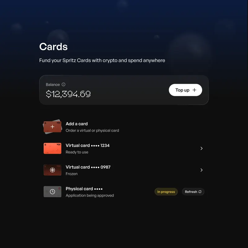
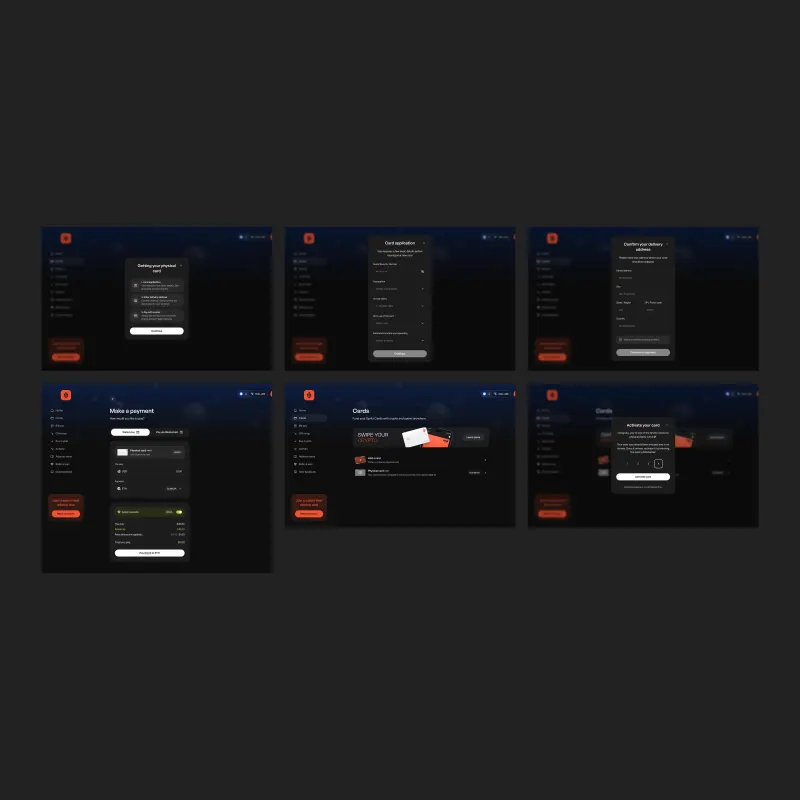
The Spritz card was one of the most complex areas of the product and did not fully exist when
I joined. I designed the experience end to end, shaping the journey from initial selection through onboarding,
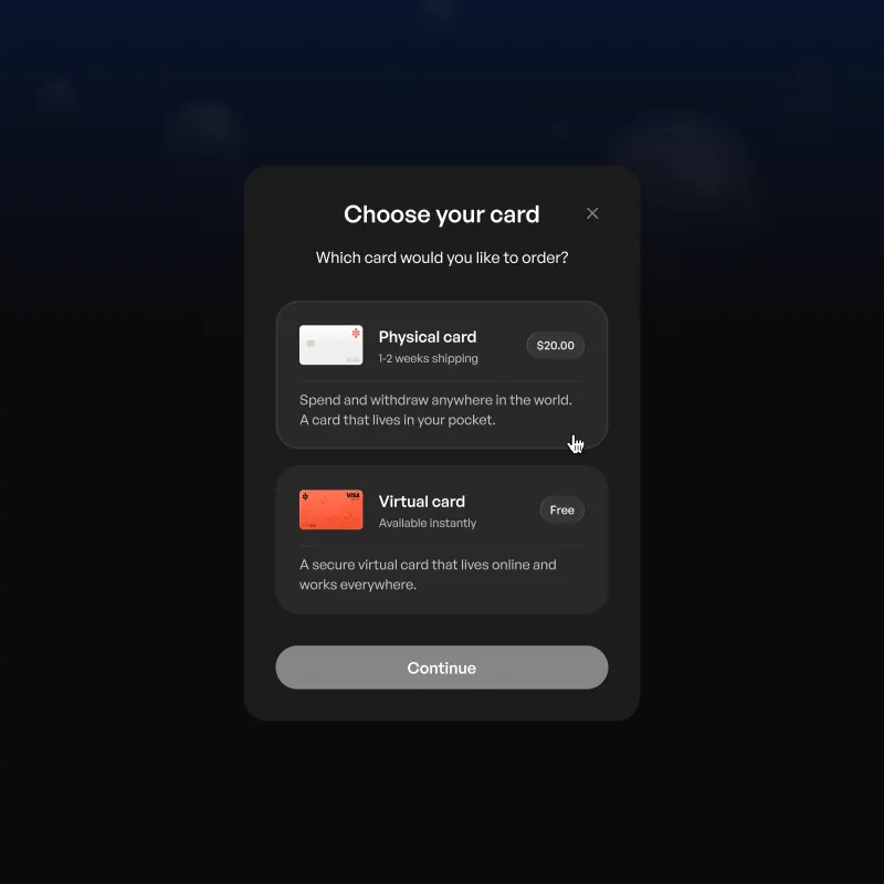
activation, and ongoing management. I guided users through card type decisions with clear trade‑offs
surfaced in context, followed by compliance requirements and a structured onboarding sequence that made the
process legible without oversimplifying it. The experience accounted for multiple states over time, from
application through to delivery and activation, ensuring users always understood where they were without
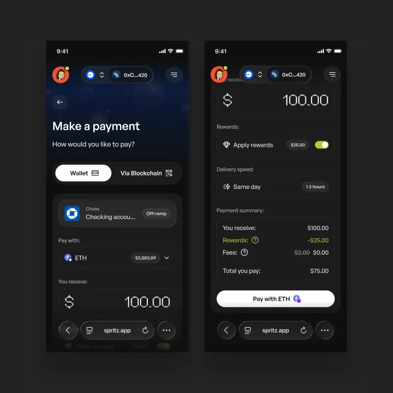
needing to navigate across different parts of the product. The payment flow unified wallet pay and blockchain
pay into a single surface, handling asset selection, rewards, fees, and confirmation within a
mobile‑optimised layout. The goal was a single surface where complex actions could complete.
Card selection. Virtual and physical options
presented with clear trade‑offs.
Custom card design. The Spritz Visa across
physical and virtual formats.
Progressive card states. Reflecting status
from application to activation.
Activation flow. With delivery context and
simple verification.
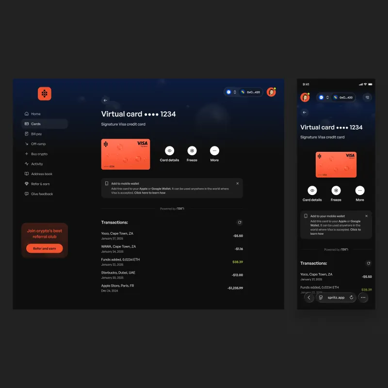
Card detail. Combining controls, wallet
integration, and transaction history.
Core Flows
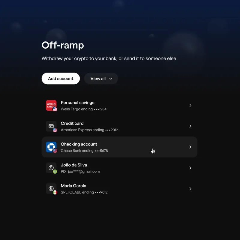
Off‑ramp was the primary revenue driver, yet the existing experience was shallow and
disconnected. I redesigned it as a complete account management surface, introducing method selection, settlement
transparency, and localisation for markets such as South America. I rebuilt the core payment flow, replacing an
inconsistent and fragile implementation with a single, coherent interface that handled crypto asset selection,
fiat conversion, rewards, fees, and context‑specific actions. I applied this structure consistently
across off‑ramp, bill pay, card top‑up, and crypto purchases, creating a shared logic across the
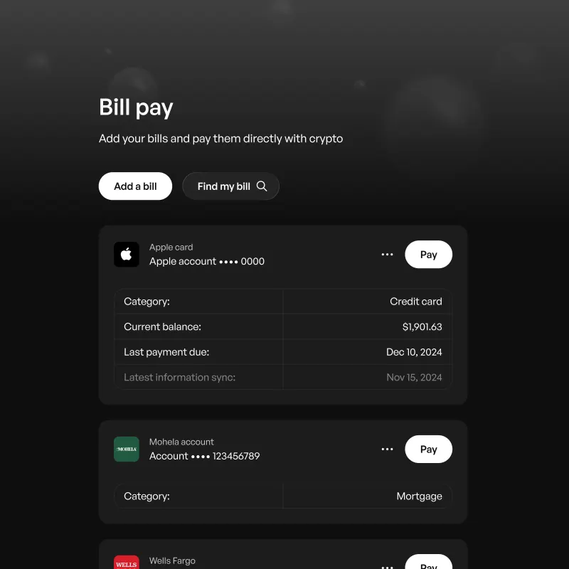
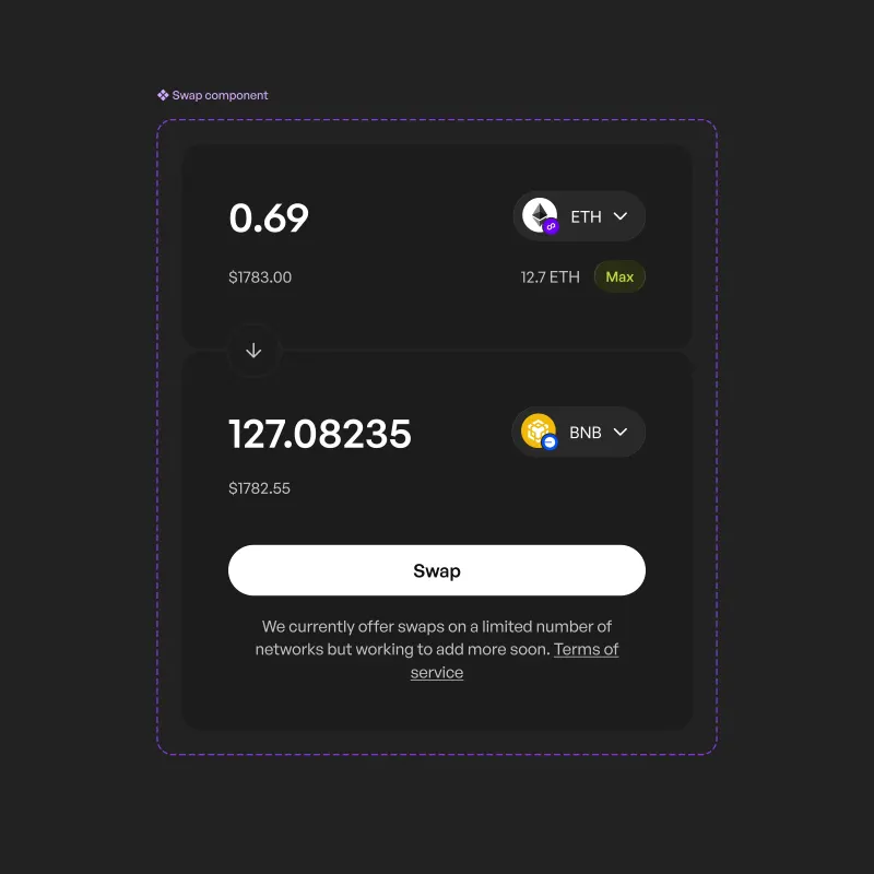
product. Other flows followed the same approach. Bill pay surfaced key information such as balances and due
dates more clearly, while I simplified swaps into a single screen, reducing the gap between intent and
completion.
Off‑ramp. Redesigned as a full account
management surface with settlement clarity and market localisation.
Payment flow. Unifying wallet and blockchain
interactions in a single responsive interface.
Bill pay. With clearer structure and reduced
friction.
Swaps. Supporting cross‑chain
transactions with simplified confirmation.
Growth & Retention
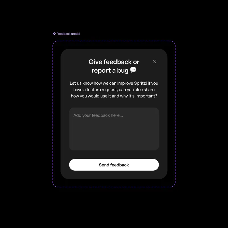
Growth work focused on creating direct feedback loops and making incentives more legible. I
introduced a persistent in‑app feedback mechanism that gave users a direct line to the team from anywhere
in the product. The framing encouraged users to explain how they would use a feature and why, filtering for
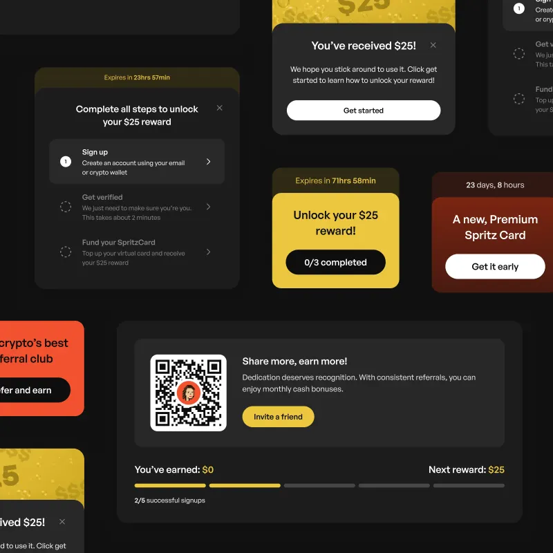
more useful signal and becoming a valuable internal input. I refined the referral system and rewards dashboard
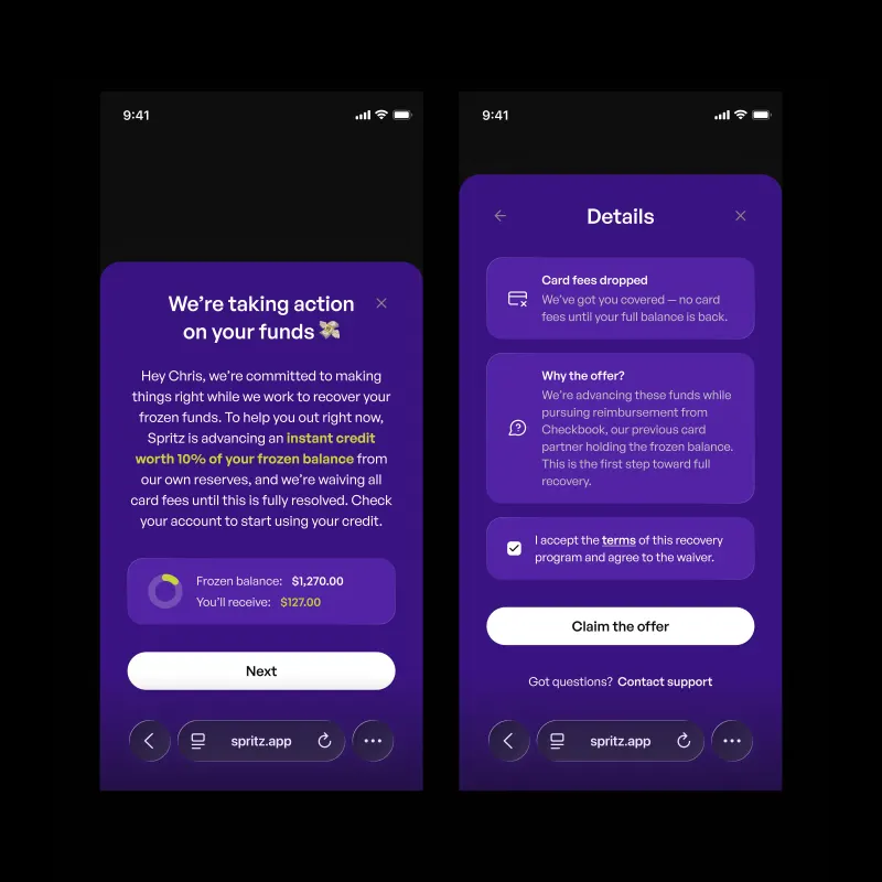
to make progress and incentives easier to understand. During a period where a third‑party provider froze
user funds, I designed a dedicated crisis communication interface that clearly separated itself from the core
product experience. I prioritised clarity and trust, explaining the situation directly and guiding users
through recovery options in a controlled and compliant way.
In‑app feedback. Designed to capture
high‑quality user input.
Referral & Rewards. With clearer progress and
incentive structures.
Crisis communication. Designed for clarity,
separation, and trust.
Outro
Spritz was a full system rebuild. One designer across brand, product, and growth. The work
established a consistent foundation across payments, compliance, and crypto. The most meaningful outcome was
not any individual feature but the coherence of the system as a whole. The product felt deliberate and legible,
and it gave the team a foundation to build from.
Kurtosys
Kurtosys is a digital experience platform for the asset management industry, enabling fund
managers to distribute data, documents, and insights to institutional investors globally. I joined in 2018 as a
product designer and grew into the role of lead product designer, ultimately becoming responsible for the design
language, core platform, and key client experiences across the business.
Roles: Product Designer – Lead Product Designer
Timeline: Nov 2018 – Feb 2021
Teams: Product, Engineering, Marketing, Client Services
From Fragmentation to System
My first project was a reporting tool for BNY Mellon. It was already underway, but lacked
coherence in both product thinking and execution. I took ownership of the design and, in parallel, started writing frontend code. That overlap quickly became a defining advantage. Decisions
collapsed faster, feedback loops tightened, and the quality of the product improved as design and
implementation moved together rather than in sequence.
At the same time, I began refining the core platform. What started as small visual adjustments
exposed deeper structural issues. The product had evolved without a unifying logic, with multiple navigation
systems, inconsistent branding, and no shared hierarchy across the interface. I approached it as a system
problem, working layer by layer through typography, colour, layout, and components until the product resolved
into a single, coherent language. This work led to a promotion into the core product team, with responsibility
for design across the entire platform.
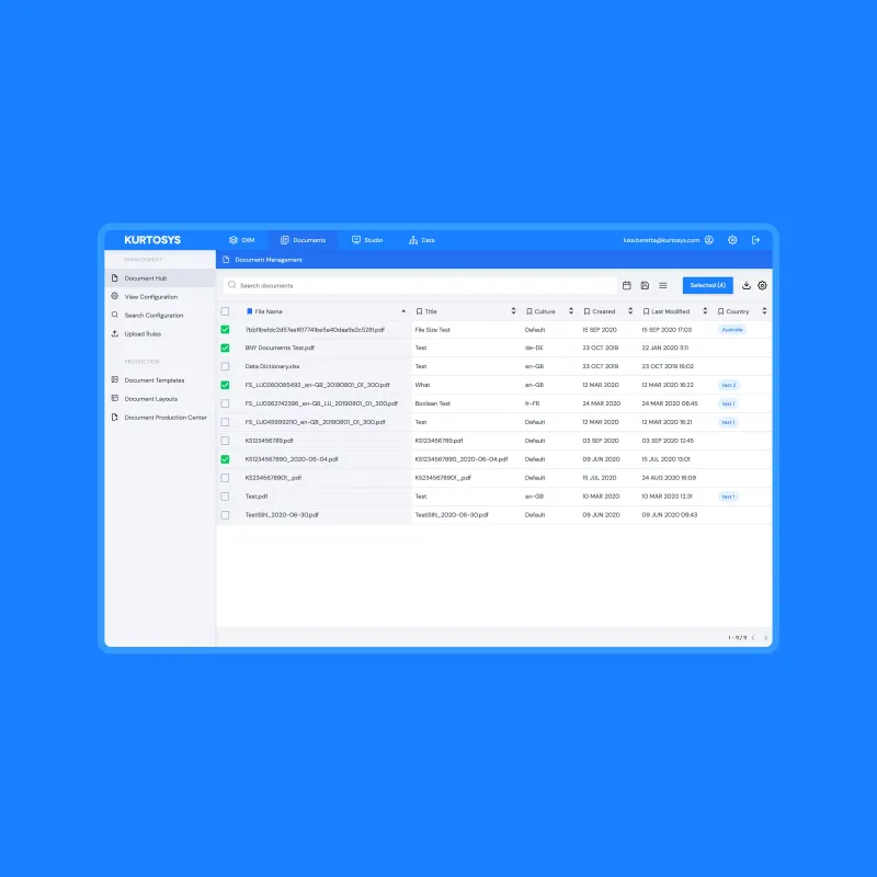
Before. The platform showing fragmented
navigation, overlapping product identities, and no shared hierarchy.
After. The application resolved into a unified
shell with a consistent type system and a single navigation model.
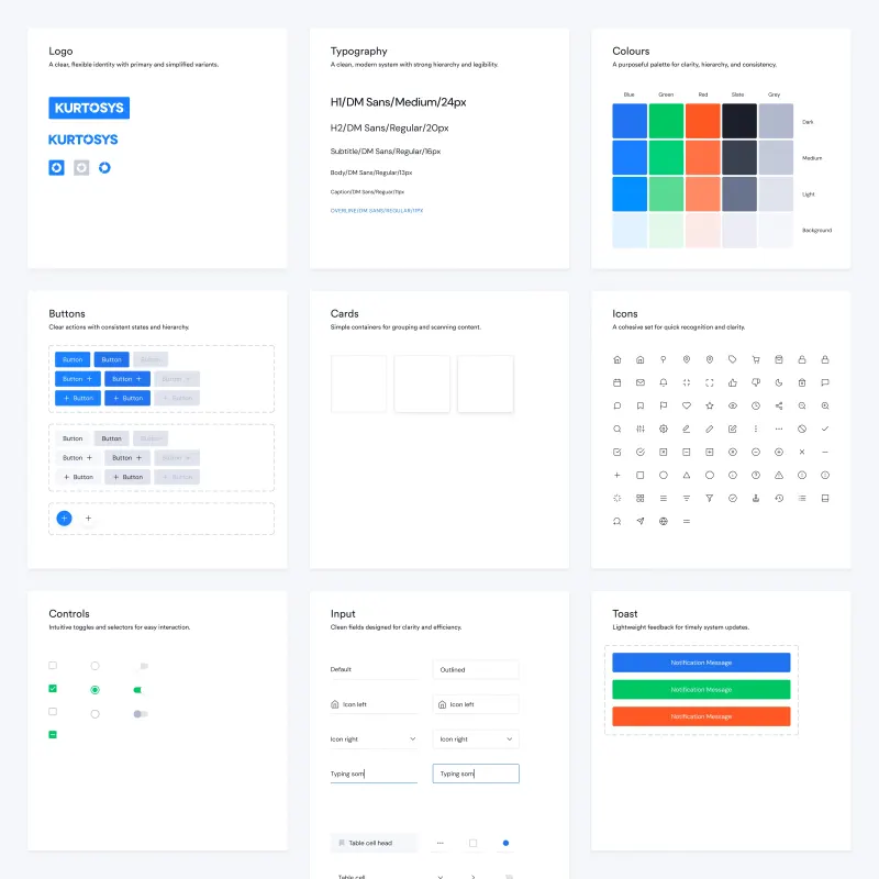
Foundations. Typography, colour, and core visual language.
A System Designed to Scale
As the company grew, consistency became an operational requirement rather than a visual
preference. I built the Kurtosys Design System as a shared foundation across design, engineering, and
marketing, defining typography, colour, iconography, and a comprehensive component library that extended from
core interface elements to complex data visualisation patterns.
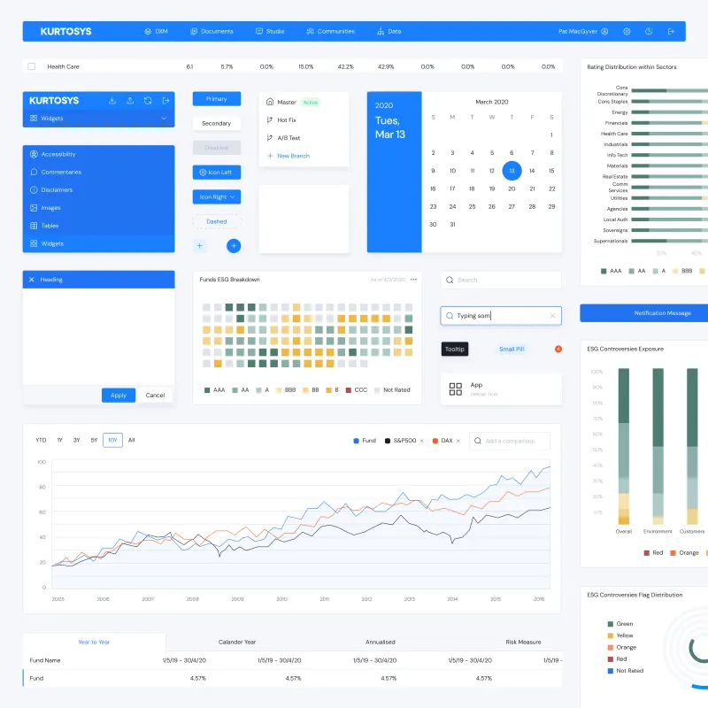
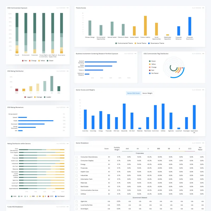
The system went beyond interface components. I designed a modular library of financial charts
and ESG reporting tools, along with a catalogue of composable Studio Apps that allowed teams to assemble
client‑facing products without writing code. For a company of roughly 200 people, it became the single
source of truth for how Kurtosys products were built and experienced.
Design System. Foundational components and patterns used across product and marketing.
Component Library. Reusable interface patterns
built for scale.
Data Visualisation System. Financial and ESG
reporting.
Studio Apps. Modular composition of client
experiences.
Kapital: One System, Many Expressions
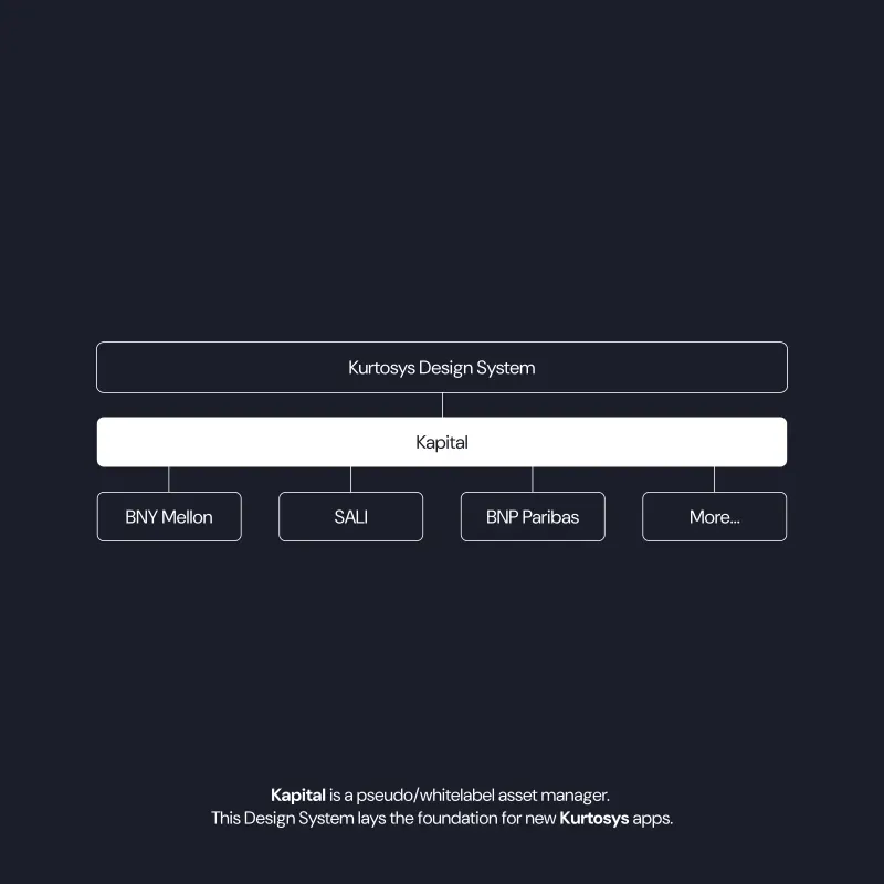
On top of this foundation, I designed Kapital, a white‑label product layer that allowed
Kurtosys to deploy tailored client portals from a shared system. Each client got a distinct visual language
while inheriting the same underlying structure, components, and interaction patterns.
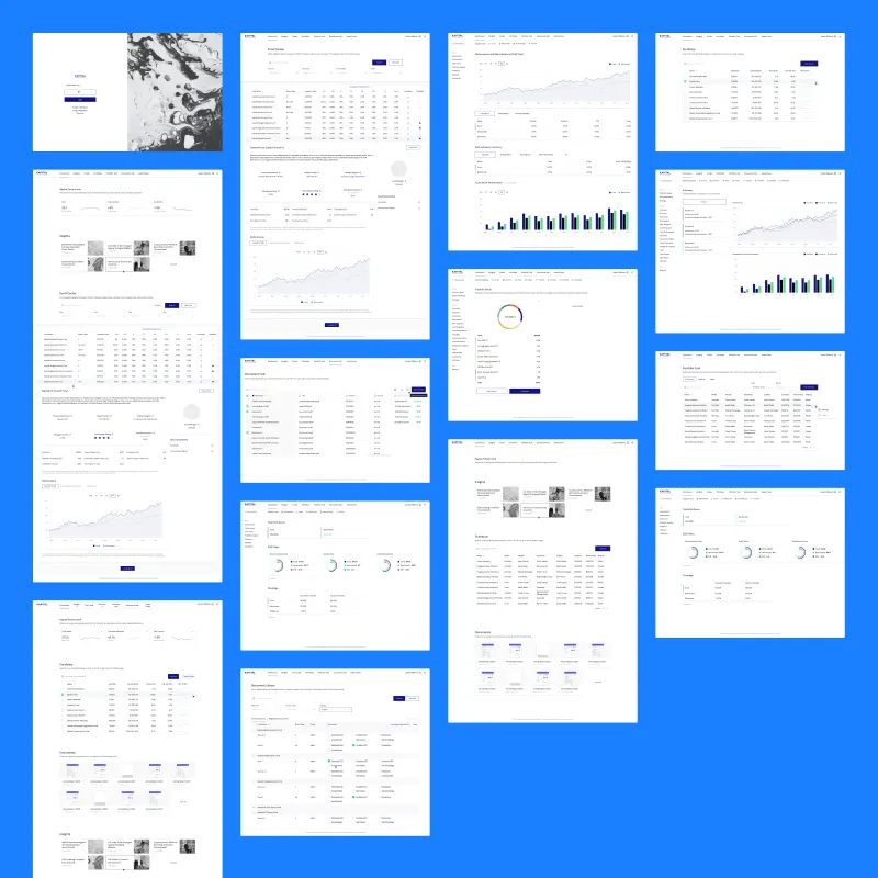
Clients including BNP Paribas, SALI, OP, and BNY Mellon each received a distinct visual
language, while the core experience remained consistent. The product surface covered the full investor journey,
including dashboards, fund discovery, portfolio tools, document management, and advanced analytics. The
Optimizer was a two‑step portfolio construction tool based on mean‑variance optimisation, letting
users define constraints, explore the efficient frontier, and apply portfolio allocations directly. I designed
every surface, including responsive and print outputs, as part of a cohesive system.
Architecture. A shared system branching into
client‑specific implementations.
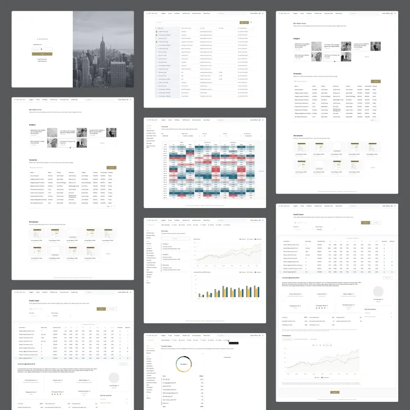
Template library. Login, dashboard, fund
centre, portfolio tools, and document management, restyled per client.
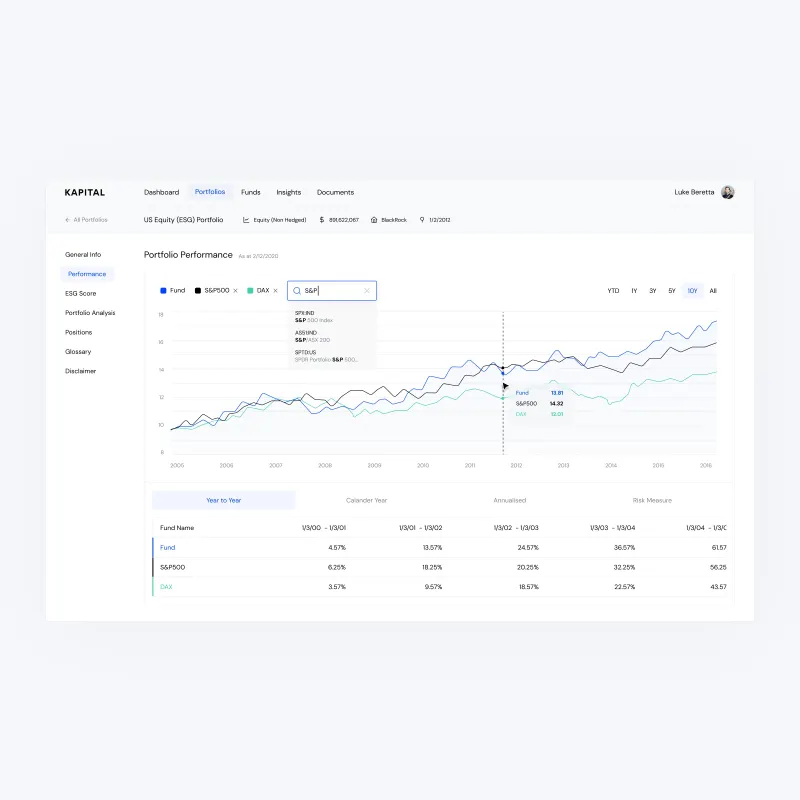
Portfolio Performance. Benchmark comparison and
analytics across fund positions.
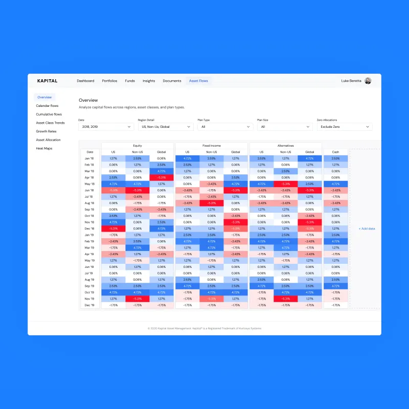
Asset Flows. Capital flow analysis across regions, asset classes, and plan types.
Designing at Institutional Scale
Client work introduced a different level of complexity, shaped by data density, regulation,
and context. For SALI, I designed a full investor portal including authentication, portfolio tools, and
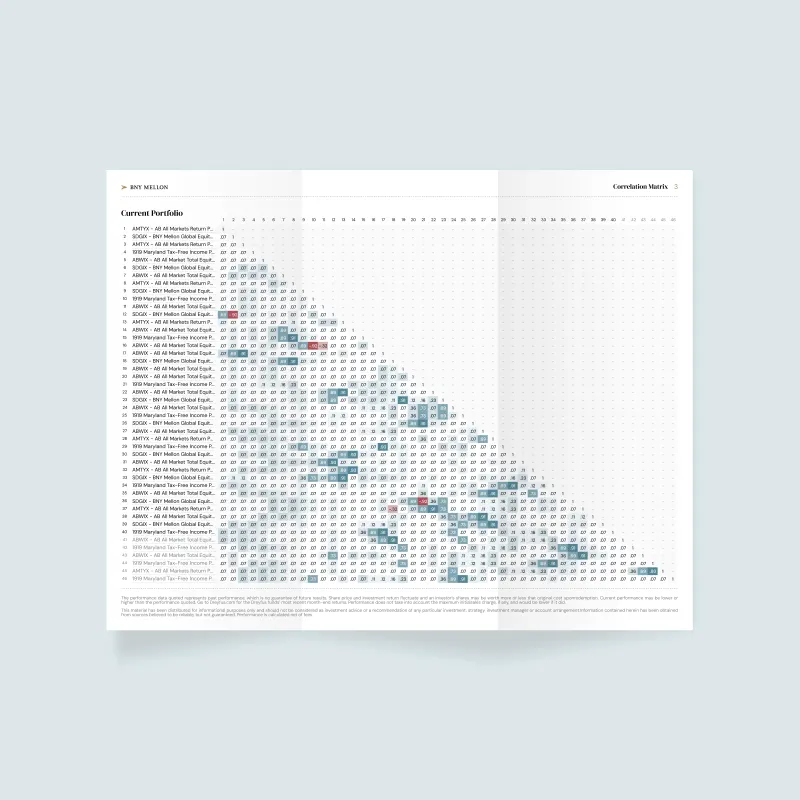
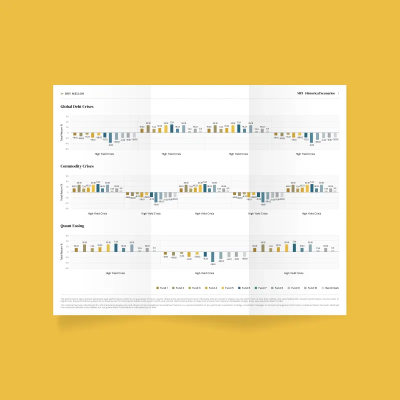
administrative controls suited to a regulated environment. For BNY Mellon, I designed portfolio analytics and reporting tools, including large‑scale correlation matrices
and scenario analysis across dozens of funds. The density pushed the limits of what conventional interface
design could handle.
For BNP Paribas, I adapted the system to support ESG‑focused investment products,
aligning the experience with their brand and strategy. For OP, I developed and refined parallel design
directions with the client. Across all engagements, the goal was the same: complex financial data needed to
feel structured and legible.
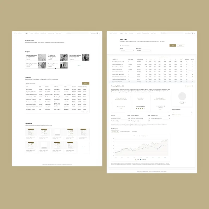
BNY Mellon portal. Investor portal covering authentication, fund discovery, and portfolio tools.
BNY Mellon dashboard. Performance analytics and portfolio overview.
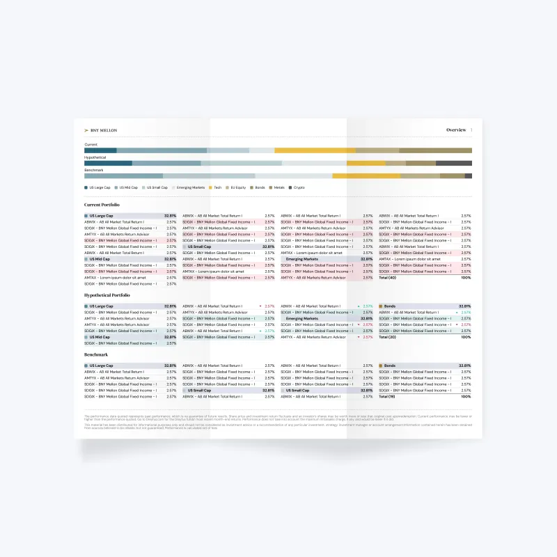
Print report overview. High‑density fund data across asset classes and benchmarks.
Correlation matrix. Large‑scale cross‑fund analysis at extreme data density.
MPI report. Scenario analysis across fund sets with structured data hierarchy.
Extending the System Beyond Product
Later, my scope expanded into brand and marketing. I worked alongside an external brand lead
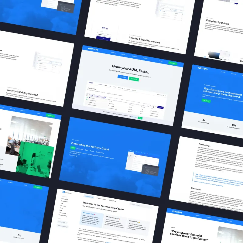
on a company rebrand and later took full ownership, redesigning and building the Kurtosys website. The work extended across product marketing, case studies, and a full documentation
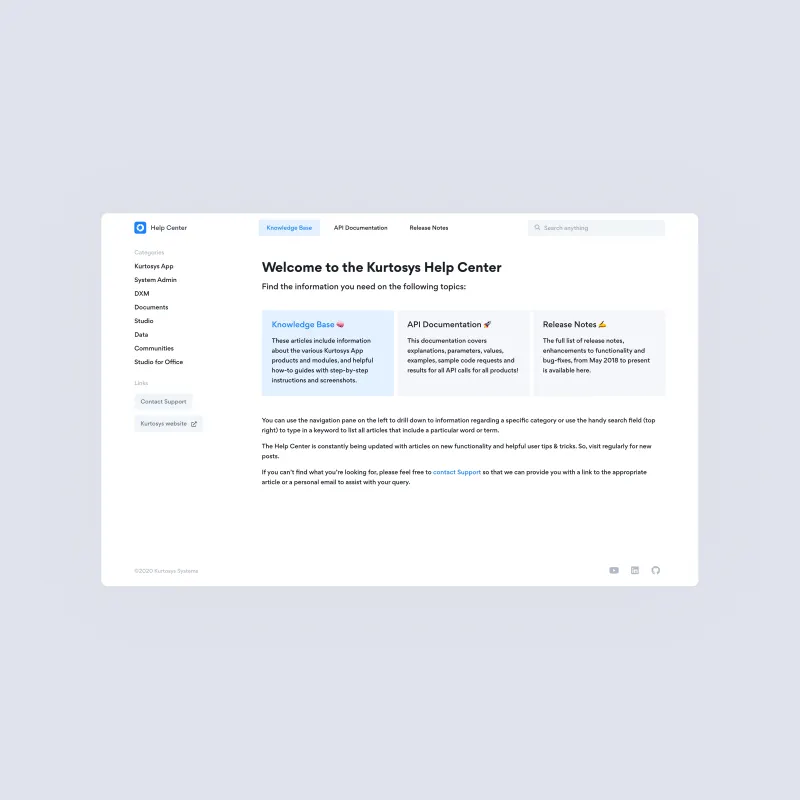
ecosystem including knowledge base and API documentation.
I also brought the design system into WordPress, aligning marketing output with the same
principles used in the product. By the time I left, I was responsible for the full design surface of the
company, spanning product, platform, brand, and client work.
Website. Marketing pages and product
narratives.
Documentation. Knowledge base and API
reference.
Platform. Design system applied across the
live product.
System View. All components and visual
language in a single context.
Outcome
I joined Kurtosys as a designer who could code and left having defined the systems that shaped
the company's product and client experiences. The shared design language outlasted my tenure. The system
continued to scale after I left.
Peach Payments
Peach Payments is a payment orchestration platform serving Africa's leading enterprise
merchants, from Superbalist and Travelstart to Computicket and iStore Group. When a new head of product joined
from the US with a mandate to elevate design as a core function, he recruited me from Kurtosys to lead it. I
joined in March 2021 as Senior Product Designer and spent the next 19 months building the design foundation the
company needed to scale: a new brand direction, a cross‑product design system, a rebuilt merchant
dashboard, a redesigned onboarding flow, and a customer‑facing checkout that finally worked on mobile. I
worked directly under the head of product, maintained close relationships with the CEO and engineering leads,
and mentored a small in‑house design team.
Role: Senior Product Designer
Timeline: Mar 2021 – Sep 2022
Team: Design, Engineering, Product, Marketing
Brand & Design System
Peach was beginning a rebrand when I joined. I narrowed the agency shortlist, shaped the brand
direction with the chosen agency, then took over the inhouse execution alongside the marketing lead. The brand that emerged had energy but also tension. The bold, playful tone the marketing team favoured
didn’t always translate cleanly into product, where merchants needed to feel in control of serious
financial operations. I defined a separate product aesthetic: more restrained, more precise, with the brand
colour used as an accent rather than a statement.
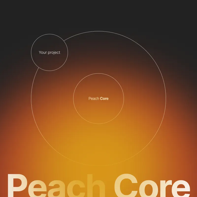
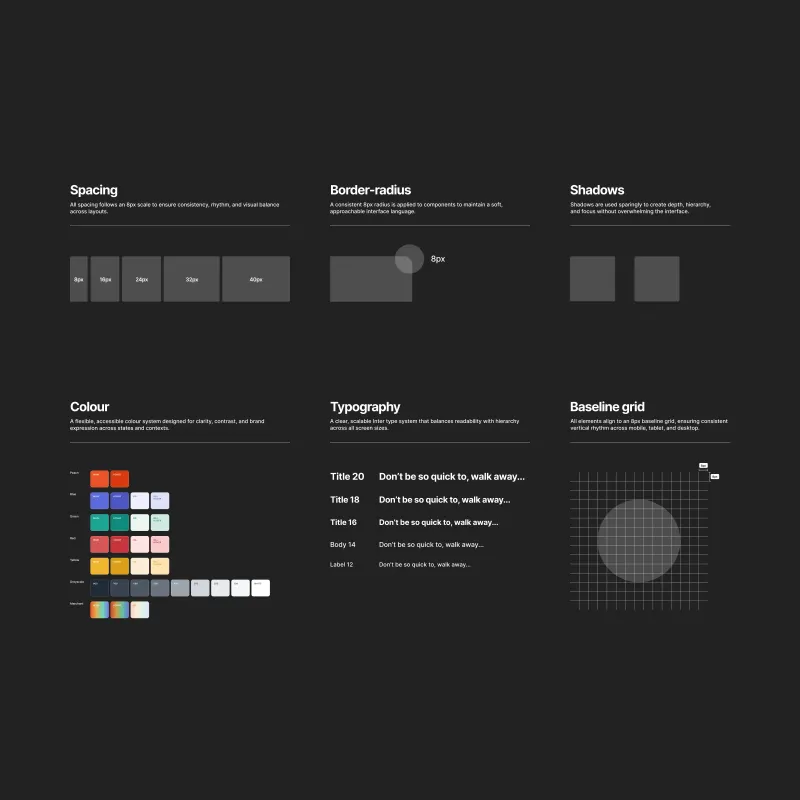
From that product direction I built Peach Core, the core design system for all Peach Payments
products. Peach Core covered foundations (8px spacing system, border radius, colour palette including a dynamic
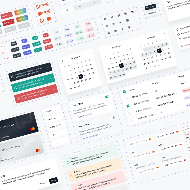
merchant token, typography scale, baseline grid), and a complete component library of hundreds of components
adopted by
engineering across the dashboard, checkout, and marketing website. It wasn’t just a Figma file. It became
the shared visual language for everything the company shipped.
Peach Core. The core design system for all
Peach Payments products, designed in Figma.
Foundations. Spacing multiples, 8px border
radius, semantic colour palette, typography scale, baseline grid.
Component Library. Hundreds of components
including
Alert, Button, Date picker, Modal, Table, Skeleton loader, Toast, and more.
Dashboard
The merchant console I inherited was engineering‑led, bloated, and clearly undesigned.
Navigation read like a sitemap. Data had no hierarchy. Merchants complained, support tickets were high, and the
product showed no evidence of design thinking at any meaningful level. I owned the new dashboard from day
one.
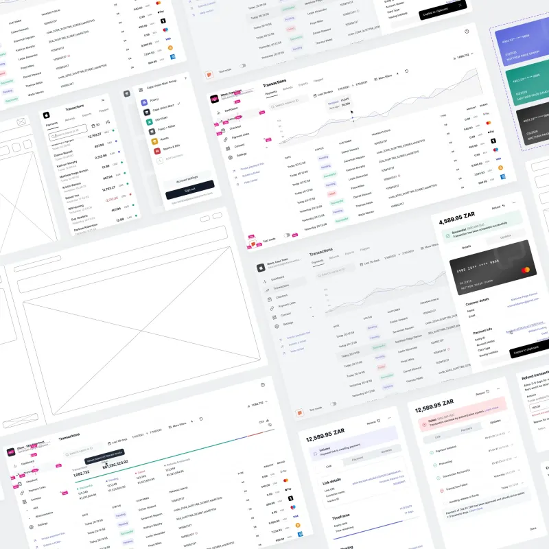
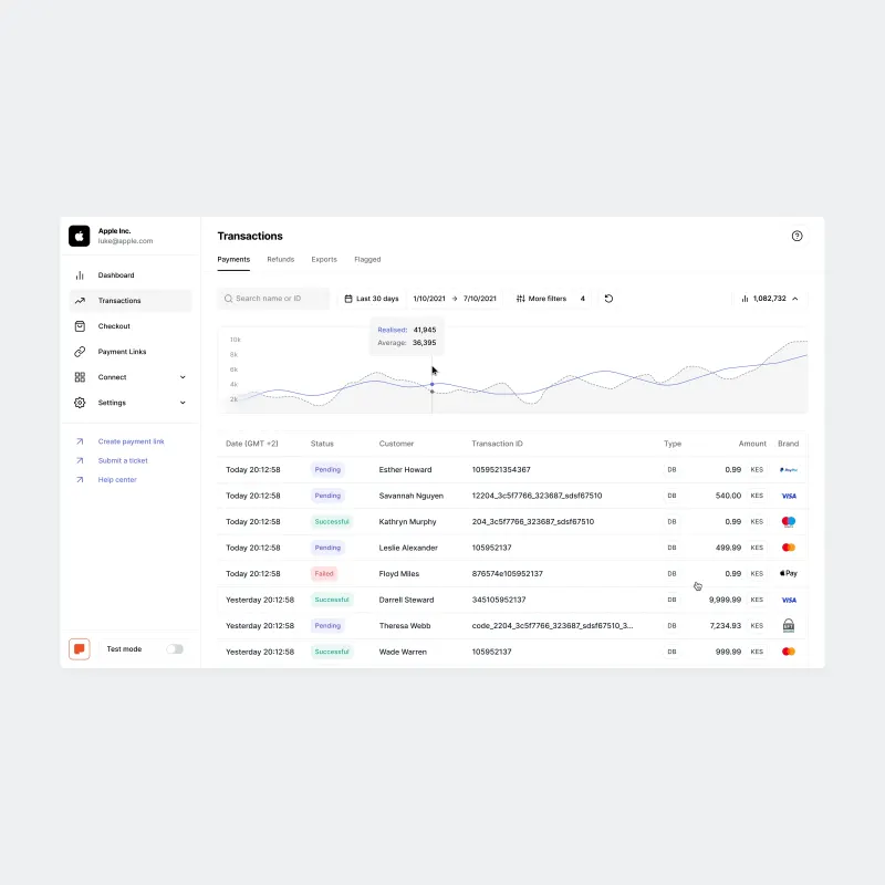
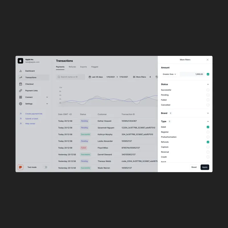
I built the new dashboard as a full merchant operations platform. The transactions surface
covers search, date filtering, advanced filters, a summary row that reflects active filter state, and a
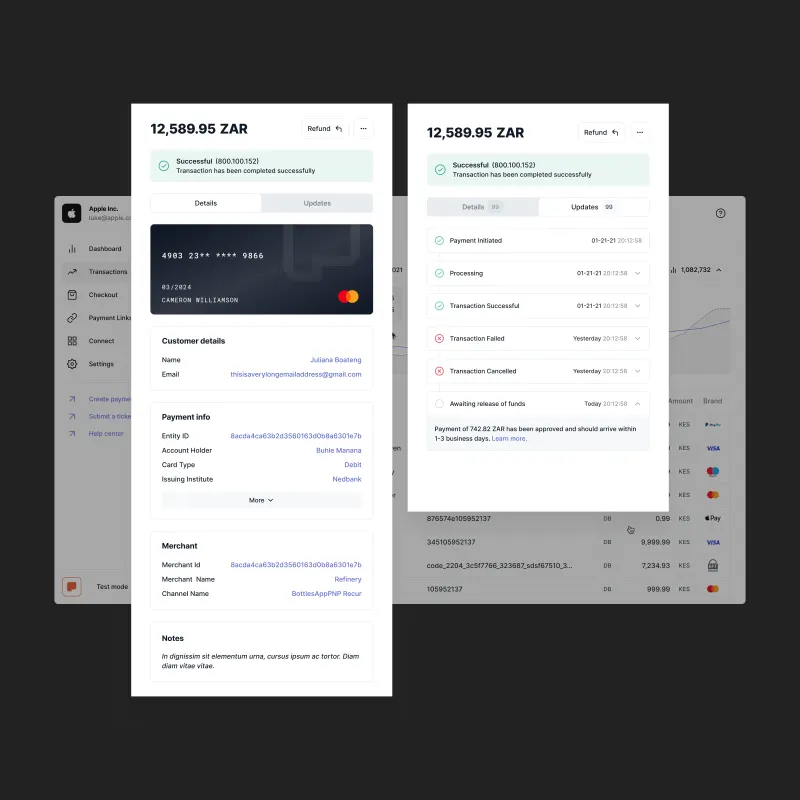
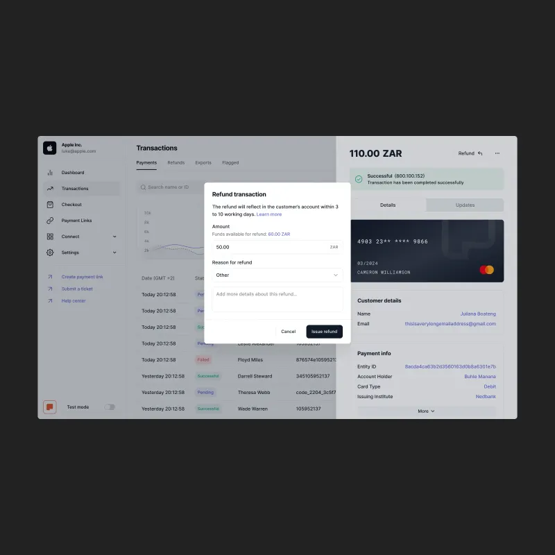
slide‑out detail panel showing a rendered card visual, full customer and payment information, a complete
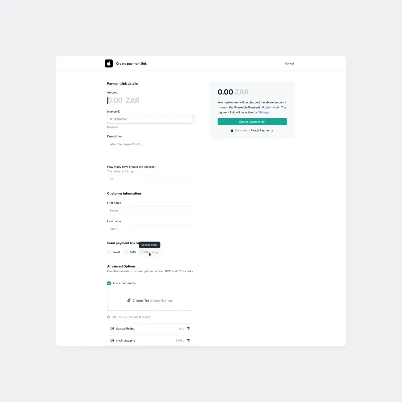
audit timeline, and an inline refund flow. Payment Links brought the same pattern to link‑based
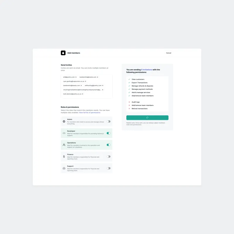
commerce: creation, multi‑channel dispatch, status tracking, and settings in a coherent system. Team
management introduced role‑based permissions with a live preview of what each role grants before invites
are sent.
Two decisions defined the product’s character. The first was merchant theming: instead of
logos, each merchant account gets a generated industry icon in a colour accent derived from their own brand. It
kept the interface clean across thousands of merchants while still feeling personal. The second was the mobile
dashboard, intentionally scoped to monitoring rather than full operations, but genuinely designed rather than
reflowed. Both desktop and mobile ran on a dashboard‑specific component system that extended Peach Core
without duplicating it.
I also wrote production TypeScript alongside the engineering team to close the gap between
design and implementation, doing pixel‑perfect frontend polish myself rather than accepting anything less
through back‑and‑forth handoff.
Dashboard. The rebuilt merchant operations platform, with transactions surface, merchant theming, and slide‑out detail panel.
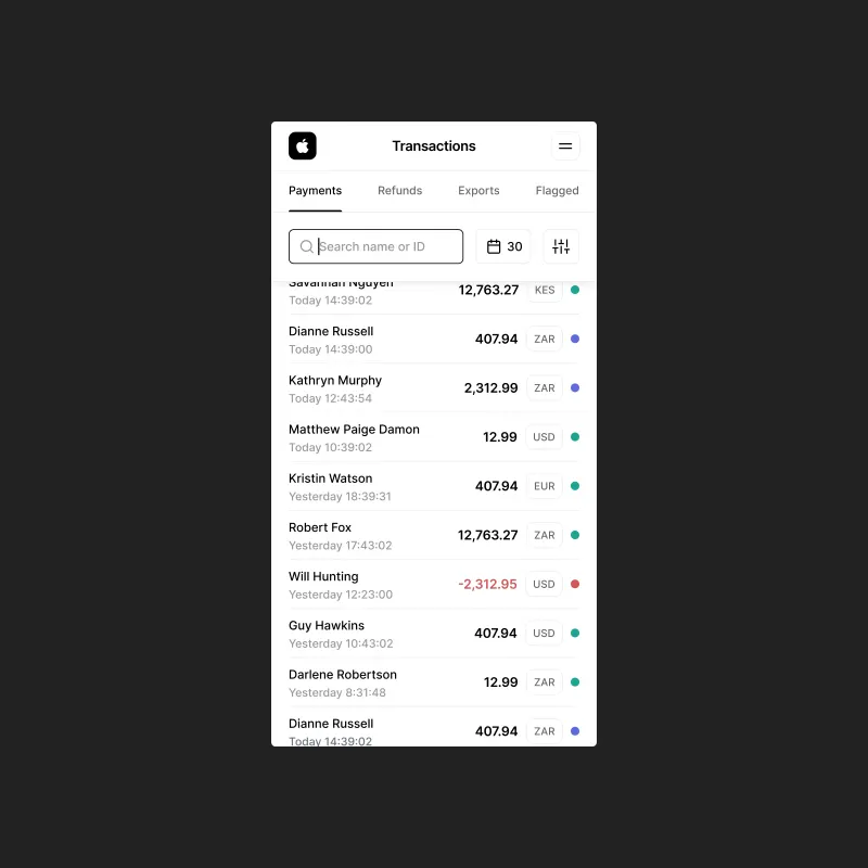
Mobile. iStore Cape Town instance, transaction
list with currency flags, intentionally scoped for monitoring.
Transactions. Filter‑aware summary row,
status pills, and payment brand logos.
Transaction Detail. Rendered card visual,
customer details, payment info, and audit timeline across Details and Updates tabs.
Refund. Amount field, available balance, reason
dropdown, free‑text notes, and appropriately weighted destructive CTA.
Advanced Filters. Amount comparator, status,
brand, and transaction type without cluttering the default view.
Payment Links. List view with sending channel
badges, link detail across three tabs, and a create flow with live preview and file attachments.
Team Settings. Role‑based permission
builder, live permission preview, member detail panel, and destructive action confirmation
modals.
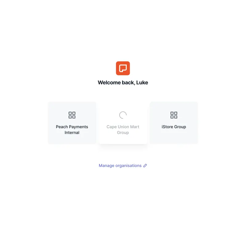
Org Picker. Multi‑entity architecture,
industry icons, real merchants including iStore Group and Cape Union Mart Group.
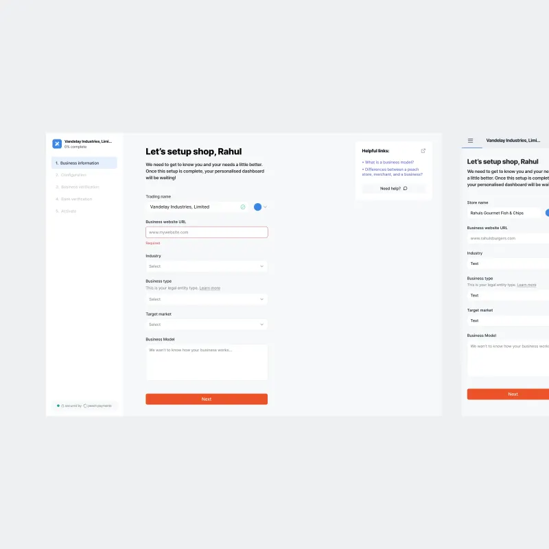
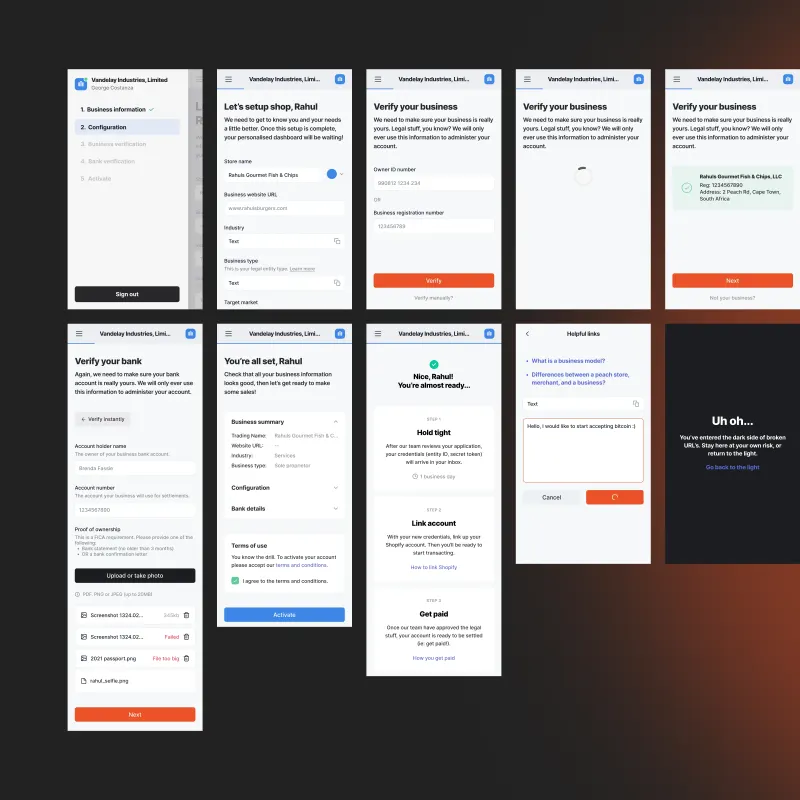
Onboarding
Merchant onboarding was the first point of real friction in the Peach relationship. The
existing flow generated significant drop‑off and support load, partly because the product made no effort
to orient new merchants or accommodate the range of business types that needed to sign up. The redesigned flow
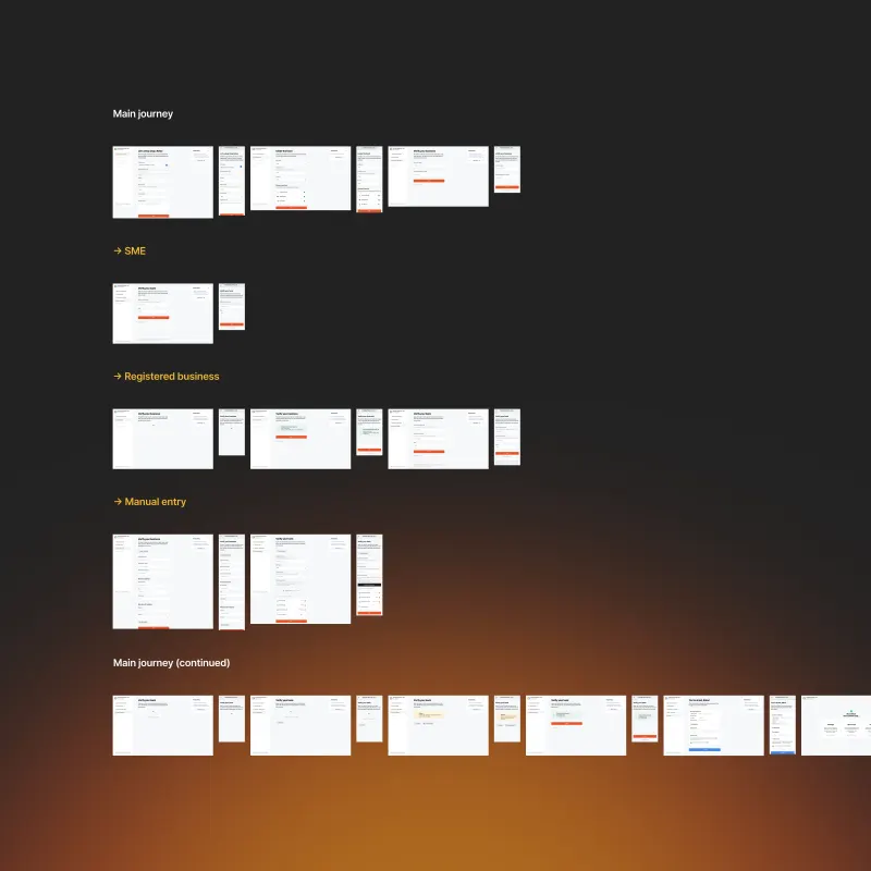
runs across five steps: Business information, Configuration, Business verification, Bank verification, and
Activate, with three distinct journey variants branching by business type: SME, registered business, and
manual entry.
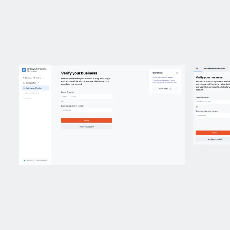
I designed every step for desktop and mobile from the outset. A persistent contextual help
panel sits alongside the form on desktop, offering relevant links and a live chat trigger at each stage. The
generated merchant icon appears from the first field entry, giving the brand identity a presence before
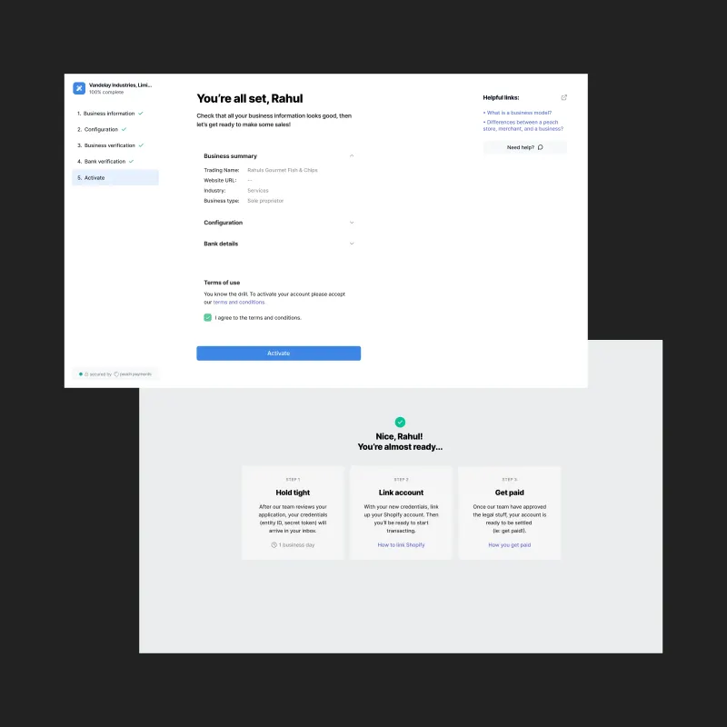
onboarding is complete. I wrote the copy to feel human rather than procedural. The final activation step
surfaces a full business summary before the commit, and the post‑submission state sets clear expectations
for what happens next. The redesign produced a measurable reduction in onboarding drop‑off.
Step 1. Business information, with the
generated industry icon appearing from the first field entry and the contextual help panel
alongside.
Mobile. Sidebar nav, thumb‑friendly form
layout, consistent merchant identity across breakpoints.
Business Verification. Minimal, focused step
with manual verification escape hatch.
Activate. Business summary accordion, terms of
use, final commit with full pre‑activation review.
Flow Map. Three journey variants (SME,
Registered business, and Manual entry) with desktop and mobile states across all steps.
Checkout
The customer‑facing checkout is the moment Peach’s work becomes visible to millions
of end consumers. Every shopper paying through a Peach‑powered merchant touches it. When I arrived it had
been overlooked. Mobile in particular was unpolished in ways that showed: nobody had cared enough to close the
gap between what was designed and what was implemented.
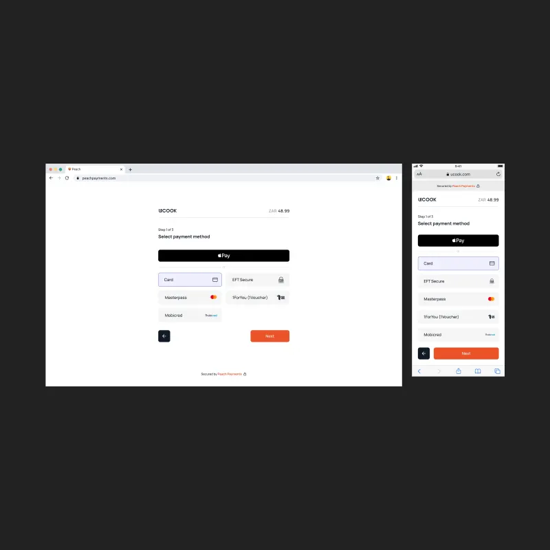
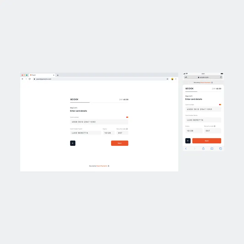
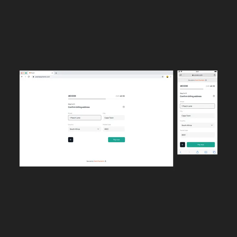
The redesigned checkout runs in three steps: select payment method, enter card details, confirm
billing address. Apple Pay leads as a native full‑width CTA where available. Alternative methods including
Card, EFT Secure, Masterpass, 1Voucher, and Mobicred appear in a clean grid with brand logos. A thin
progress bar advances across the top of each step, keyed to the merchant’s brand colour. CTAs shift colour
at the final commit step, from blue to green, signalling that something irreversible is about to happen. The
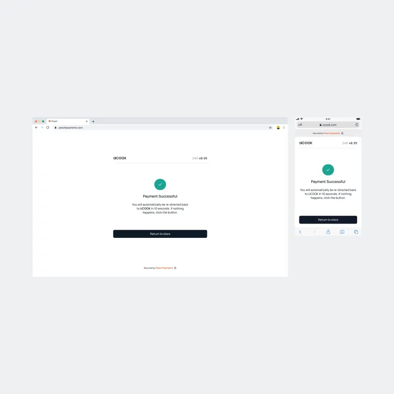
success state is calm and clear, with an auto‑redirect countdown and a manual fallback.
The checkout has its own component system, drawing from Peach Core as its foundation. I wrote
the frontend TypeScript to bring the implementation to pixel‑perfect standard where engineering capacity
and technical constraints limited what could be pushed through normal handoff.
Step 1. Payment method selection, Apple Pay as
primary CTA, alternative methods in branded grid.
Step 2. Card detail entry with real‑time
card brand detection, clean three‑column secondary row.
Step 3. Billing address confirmation, CTA
shifts to green for the final payment commit.
Success. Green checkmark, clear redirect
messaging, calm and uncluttered.
Outcome
Peach had the ingredients to build something good: the merchant base, the product breadth, the
ambition. What it lacked was design infrastructure. In 19 months I built the system that gave the company a
shared visual language, redesigned the products that mattered most to merchants and end customers, and raised
the standard of what shipping meant at Peach. The work I did on Peach Core outlasted my tenure. The company has
since raised significant funding and continued to grow. The foundation held.